D.C. Population Changes by Block
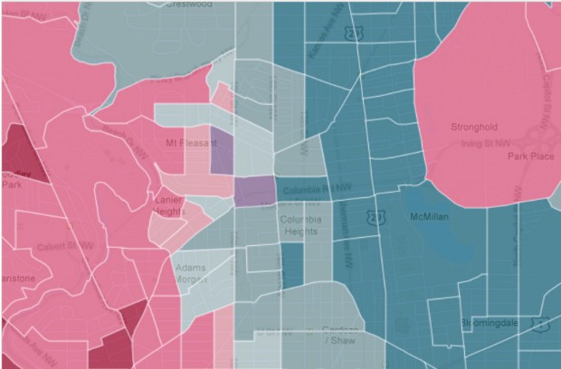
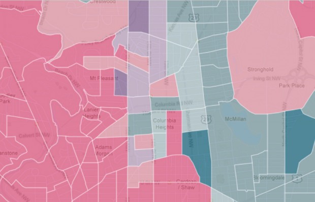
There’s nothing like a color coded map to help you understand D.C.’s demographic changes. The Washington Post‘s interactive Census map details the density of racial groups by blocks throughout D.C.-metro area. After zooming in on the District, it appears some of the most dramatic changes over the past 30 years occurred in Shaw, Columbia Heights and Petworth.
The blocks just north of the U Street corridor used to be 77 percent black and 5 percent white; now, they’re 15 percent black and 66 percent white. Columbia Heights blocks that once had a black majorities are now mostly Hispanic. Blocks between Georgia and Sherman avenues were majority black in 1990 and still are — although to a much lesser degree.
The maps below show which racial groups constitute the majority in a block area. Bolder colors represent higher percentages of that group:
1990

Screenshot / Washington Post
Population breakdown in Adams Morgan, Columbia Heights, Shaw and Petworth in 1990. (White = Pink; African Americans = Blue; Hispanics = Purple)
2010

Screenshot / Washington Post
Population breakdown in Adams Morgan, Columbia Heights, Shaw and Petworth in 2010. (White = Pink; African Americans = Blue; Hispanics = Purple)
-
Anonymous


