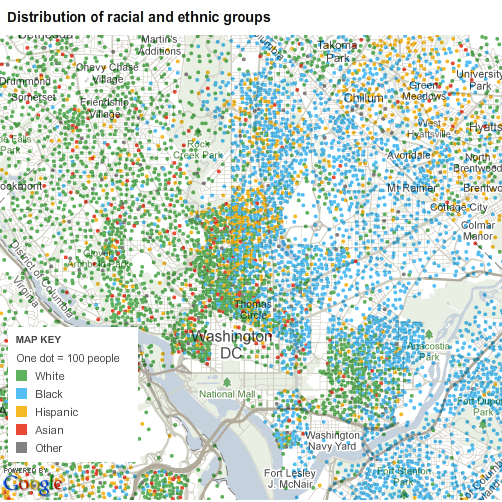
D.C. by race, by block
The New York Times has a fascinating interactive feature up where you can browse local data from the Census Bureau’s American Community Survey by entering a zipcode or city. This allows you to see the racial breakdown of a place, census tract by census tract. Here’s what D.C. looks like– the green dots each represent 100 white people, the blue dots represent 100 Black:

http://projects.nytimes.com/census/2010/explorer
A city divided by green and blue...
You can also choose to “View More Maps” and then select for “Foreign-born population”, “Asian Population”, and more. Were you surprised by the numbers for your block?


